Skip to content

The CAPED Framework

Characterizing User Skills in Chart Authoring through the Lens of Tasks and Tools

Bongshin Lee · Zhicheng Liu · John Thompson · Chenglong Wang

About CAPED

The CAPED framework characterizes skill as the ability to create a chart across five core dimensions—input data, output chart, paradigm, abstraction, and expression—pertinent to tasks and tools. CAPED is not a taxonomy of skills, nor a process model of visualization authoring. Rather, it identifies dimensions that determine what abilities are required in authoring situations. Chart authoring involves several different activities, including data preparation, visualization construction, and refinement, as well as a broad range of tools from programming languages and libraries to interactive tools. One person may have different levels of expertise for each of these activities and associated tools. In this web page, we describe three example scenarios to showcase and highlight the diverse nature of required skills in visualization authoring.

Two Different Charts with the Same Tool

An analyst creates a waterfall chart and a dumbbell chart in Excel—two tasks that demand different authoring approaches despite using the same tool.

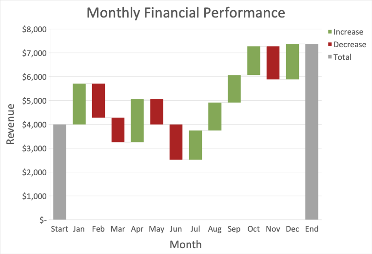
Waterfall chart via built-in template

Alex is an analyst who is asked to create a waterfall and dumbbell chartOutput Chart for a quarterly financial performance report. Alex decides to use Excel, a tool they are familiar with, to create these charts. A waterfall chartOutput Chart will illustrate changes in the company's net income per quarter. Alex prepares the dataInput Data to conform to Excel's waterfall chart templateAbstraction: grouping by quarter and computing the difference from the previous quarter. With the data properly formatted, Alex produces the chart by selecting "Waterfall" chart from the "Insert" tabExpression in Excel.

Visualization example: Waterfall chart via built-in template
Waterfall chart of quarterly net income created in Excel using the built-in "Waterfall" template.

Dumbbell chart composed from scratch

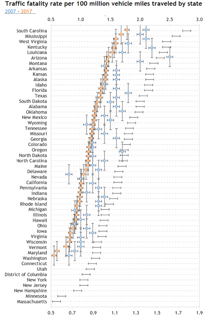
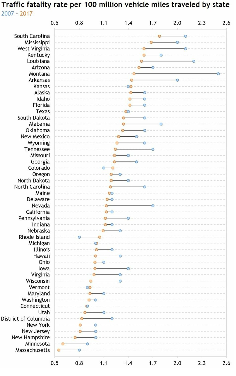
A dumbbell chartOutput Chart will show the company's actual performance against its targets. Excel lacks a dumbbell chart template, so Alex searches online and decides to follow a tutorial to create a dumbbell chart with work-aroundsParadigm. Following the tutorial, Alex organizes the dataInput Data to "Insert" a "Scatter Plot"Expression, then as a work-aroundParadigm Alex inserts error bars to connect the target and actual points. Finally, Alex must format the chart to remove unwanted visuals from the error bars to achieve a dumbbell chartOutput Chart.

Visualization example: Dumbbell chart composed from scratch
A scatterplot chart with error bars as an intermediate step towards a dumbbell chart.

Dumbbell chart final
Visualization example: Dumbbell chart final
Final version of dumbbell chart created from scratch in Excel.

Given that Alex can fluently use Excel templates to create the desired waterfall chart, a non-trivial visualization, one might consider Alex is skilled in chart authoring with Excel. However, Alex's struggle with dumbbell chart authoring contradicts this assessment. In fact, such struggle does not mean they are unskillful with Excel either, since the two chart creation processes employ completely different authoring approaches: the first involves instantiation of built-in templates from the tool, while the latter requires "hacking" to appropriate other plots to mimic the dumbbell chart. This scenario highlights that chart authoring skills cannot be characterized solely at the level of the tool. Even with the same tool, different tasks may require different authoring approaches and, consequently, different user skills.
Skills Transfer between Tools

A data engineer adapts visualization skills from Altair and D3 to Power BI, relying on programming for data transformation between chart iterations.

Multi-series line chart in Power BI

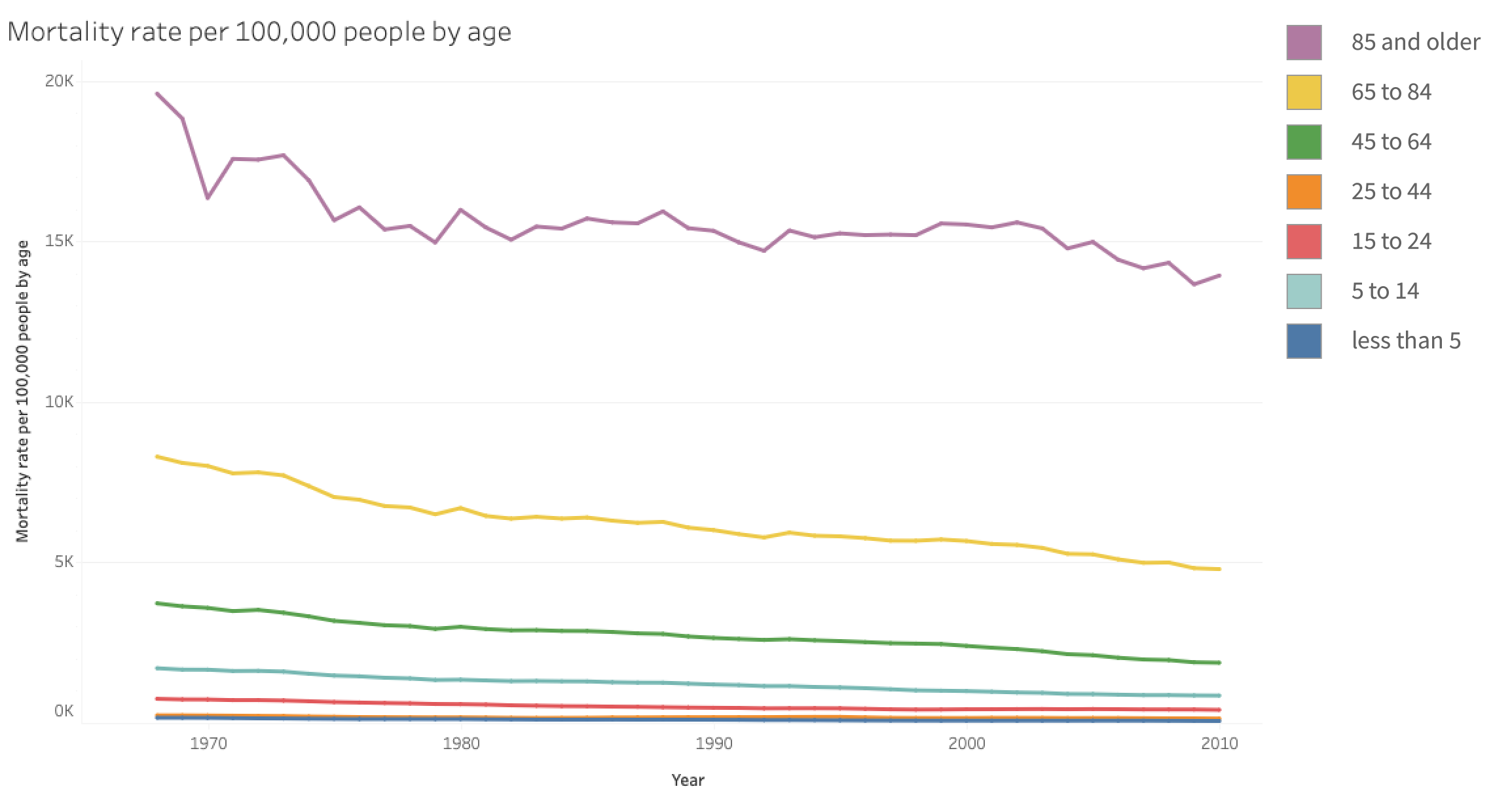
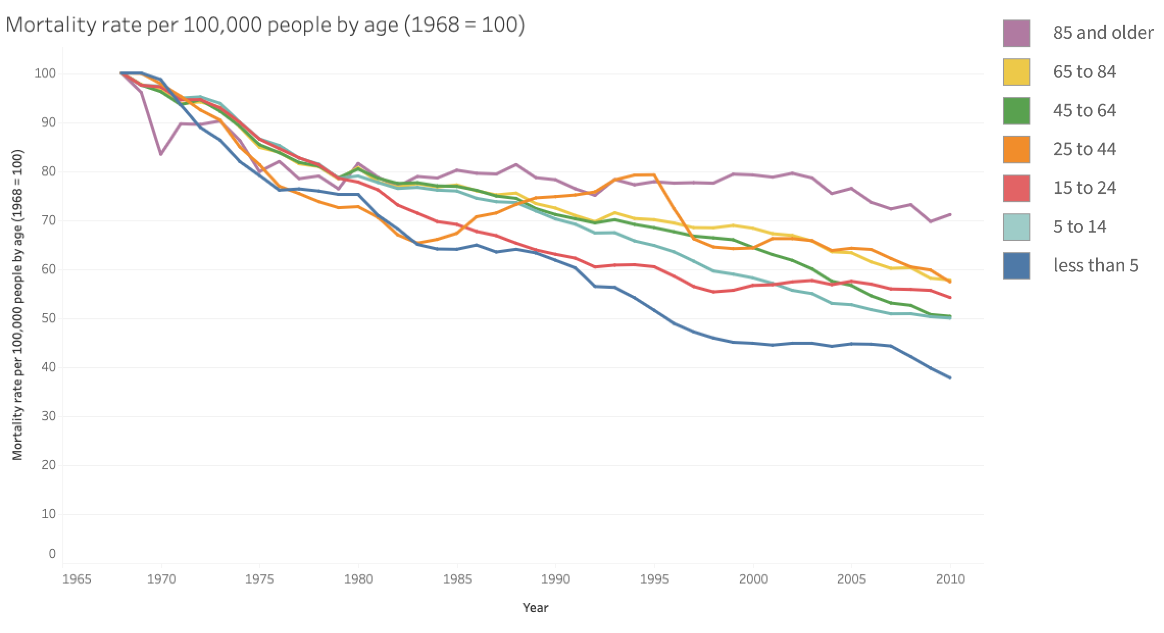
Kori is a data engineer at a public health organization. Kori is asked to create a report that explains the leading causes of death for citizens from 1968 until the present year. The dataset includes mortality rates based on the cause of death (e.g., Cancer, Heart Disease, AIDS) for each year, age group, state residence, and gender. Kori has a programming background and extensive experience creating visualizations using libraries, however, Kori's organization exclusively publishes with Microsoft Power BI. Kori decides to visualize the change in mortality rates across age groups. They create a multi-series line chartOutput Chart of "Age Group" displaying "Year" on the x-axis and "Mortality Rate" on the y-axisExpression. Noticing a steady yet gradual decline in all age groups, Kori wonders if the orders of magnitude of the line chart are overshadowed by the older age groups. Kori hypothesizes that a rate of change would allow better comparison.

Visualization example: Multi-series line chart in Power BI
Multi-series line chart of mortality rates by age group in Power BI.

Rate-of-change chart after data transformation

For this chart, Kori needs a new column of "Mortality rate change (since 1968)."Input Data They opt to write Python script to transform the dataInput Data. Using the Pandas data library, Kori loads the dataset, computes the new column, and exports the resulting dataset. Loading the dataset (with all the required fields) back into Power BI, Kori uses drag-and-dropExpression to create a line chartOutput Chart that shows on the whole, all age groups exhibit similar trends of decrease, except for a noticeable peak for the "25 to 44" age group that coincides with the AIDS epidemic.

Visualization example: Rate-of-change chart after data transformation
Line chart of mortality rate change since 1968 after transforming the data with Pandas.

Despite being relatively new to Power BI, Kori quickly adapts to it based on experience from declarative programming libraries (e.g., Altair). Visualization authoring skills are transferable, beyond the authoring medium (in this case Kori was more familiar with textual code rather than a shelf-construction UI), as Altair and Power BI share similar authoring concepts of mapping data columns to visual channels. However, transfer of skills is not bi-directional as someone with only Power BI experience would need to learn additional programming skills to use Altair. Thus, when characterizing skills, we need to consider not only visualization concepts but also the medium to express these concepts. Secondly, this scenario highlights the importance of data transformation in the visualization authoring process While this step is often overlooked , it becomes essential when authors need to test hypotheses and prepare the desired charts. In Kori's case, they relied on a familiar programming paradigm to transform data. However, they could have used Power Query (a companion tool of Power BI).

Different Authoring Skills to Work with AI

An analyst uses an AI assistant to compare job offers, discovering that effective AI-supported authoring requires code verification, design critique, and targeted prompting.

Initial prompt produces a flawed grouped bar chart

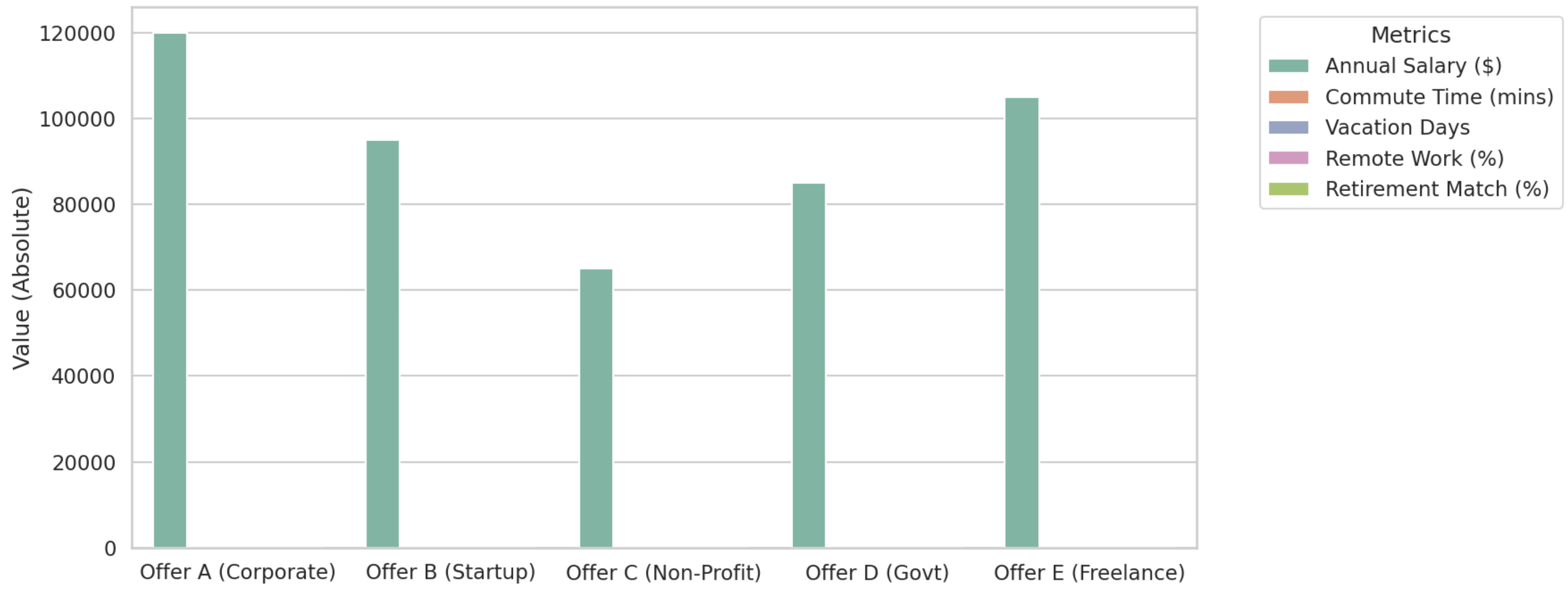
Jesse, an analyst experienced with both programming and a strong understanding of visualization design, wants to compare four different job offers based on: Annual Salary ($), Commute Time (minutes), Vacation Days, Remote Work, and Retirement Match. Jesse uploads the dataset to an AI assistant and prompts: "Create a bar chart to compare these job offers."Expression The AI assistant defaults to generating Python code for a standard grouped bar chartOutput Chart, directly comparing these values side by side. However, Jesse notices only one bar (Annual Salary) is shown for each offer. Jesse examines the code generated by the AI assistantParadigm, and confirms that the code is correct but still cannot see the other missing data. Jesse realizes these five metrics span markedly different value ranges–many values are not visible to the eye. Jesse concludes a grouped bar chart is inappropriate in this context.

Visualization example: Initial prompt produces a flawed grouped bar chart
Grouped bar chart from the AI assistant's initial prompt—salary dominates because the metrics use different scales and units.

Targeted follow-up produces a parallel coordinates plot

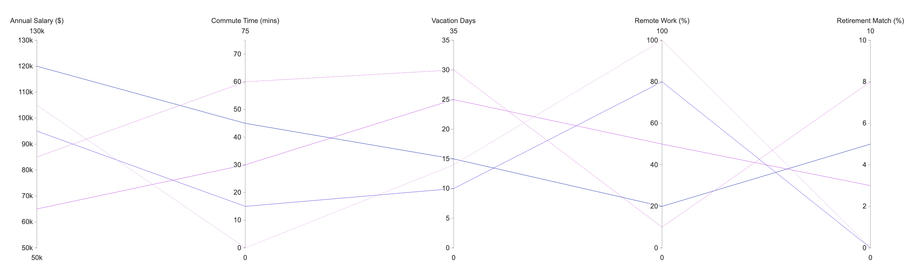
Jesse now provides a specific follow-up promptExpression to avoid ambiguous interpretation from the AI assistant: "Change this to a parallel coordinates plot. Give each variable its own vertical axis, normalize the scales, and color the lines based on the job offer."Expression The AI assistant handles the complex data normalizationInput Data and plotting logic, and successfully generates a readable parallel coordinates plotOutput Chart. Jesse can now compare the jobs across all dimensions.

Visualization example: Targeted follow-up produces a parallel coordinates plot

With LLMs, Jesse can generate complex visualizations like a parallel coordinates plot. Thus, it is tempting to assume that the AI assistant "removes" the chart authoring skill requirement en- tirely. However, Jesse's success does not come from the AI agent; it relies on a combination of programming and visualization composi- tion knowledge. While the AI accelerated the generation of complex code, Jesse's programming expertise was essential to first inspect and confirm code was syntactically correct but inappropriate in terms of chart design. Jesse then needed the conceptual knowledge to diagnose why the grouped bar chart failed and the precise visualization vocab- ulary to instruct the AI on the appropriate fix. Automated tools do not eliminate traditional skills; rather, they transform them. Chart authoring skills must evolve to encompass code verification, targeted prompting, structural critique, and the ability to steer AI agents away from conceptually flawed defaults and toward appropriate solutions.

The Same Chart Using the Same Tool

Authors create the same chart in ggplot2 and Charticulator—but different input data shapes and authoring paradigms demand different skills even within one tool.

Reshaping data for a faceted line chart

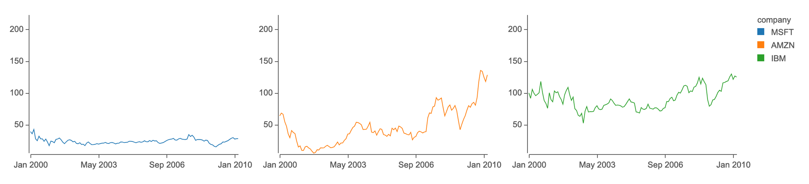
The faceted line chartOutput Chart shows stock prices (y-axis) during the same time periods (x-axis) for three companies: IBM, Microsoft (MSFT), and Amazon (AMZN). ggplot2 incorporates methods to manipulate input data and output charts, supporting alternative design approachesParadigm to authoring the same chart with two different input data schemasInput Data. Given data in the long formatInput Data with "date", "company", and "price" columns, authors can employ the facet_grid operatorExpression to create faceted sub line chartsOutput Chart with the column "company"; if the input data is in the wide formatInput Data with "date", "MSFT", "AMZN", and "IBM" columns, authors can apply different configurations to the same base chart using lappy operationExpression to produce a repeated line chartOutput Chart for each company.

Visualization example: Reshaping data for a faceted line chart
Faceted line chart of stock prices created in ggplot2.

Composing vs instantiating a ribbon chart in Charticulator

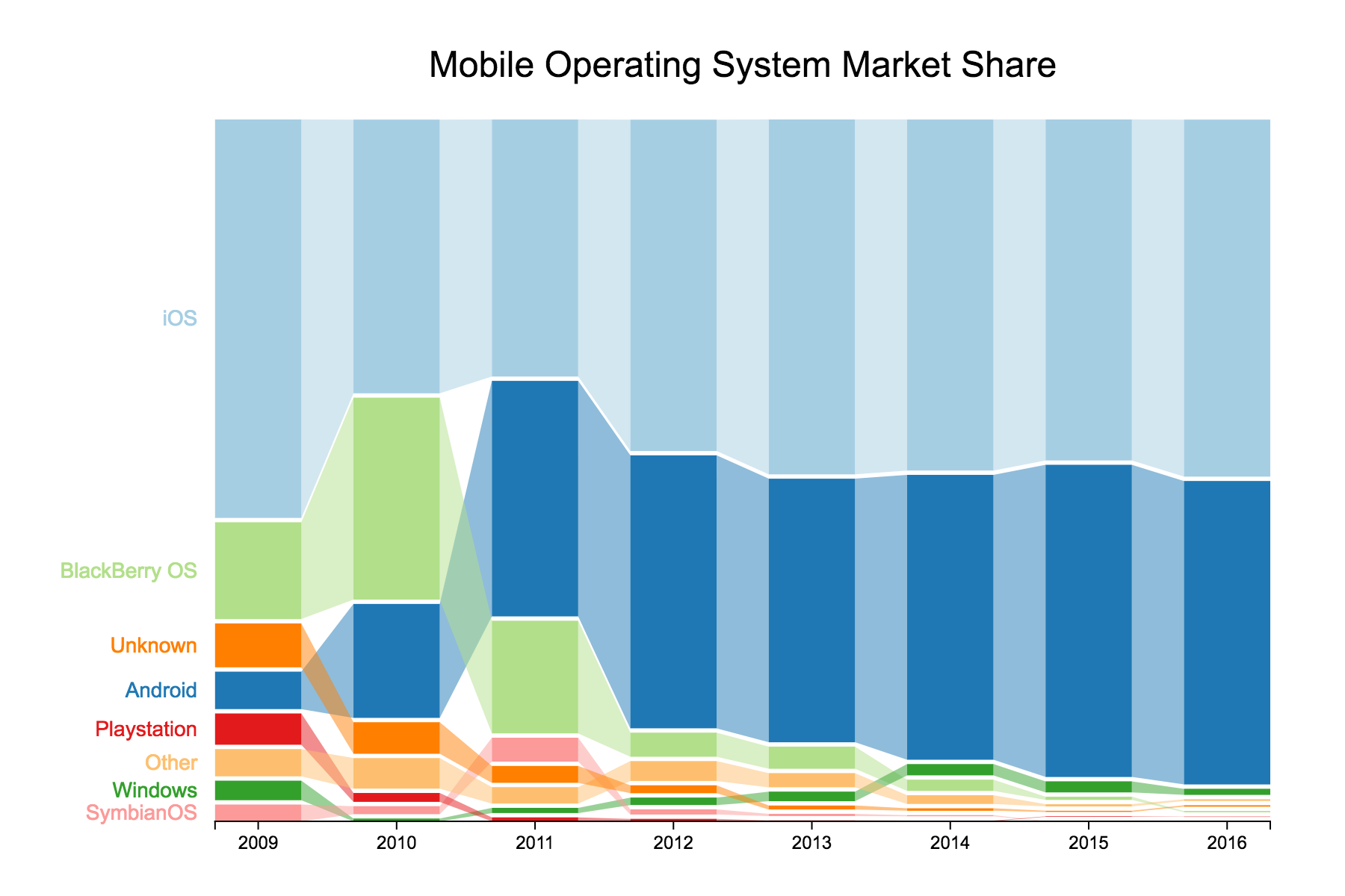
Charticulator provides two ways to create a ribbon chartOutput Chart: by constructing from scratchParadigm (paradigm: compose), or by using a ribbon chart templateParadigm (paradigm: instantiate). In this example, a ribbon chart showsOutput Chart mobile operating system market share from 2009 to 2016. The input data includes "operating system", "year", and "share" columns. For an author to compose this ribbon chart, they start by encodingAbstraction a rectangle glyph's height by "share" and the x-axis of the chart by "year". Then they encodeAbstraction the "operating sytem" to the color and apply a Stack Y to the glyphs and order the stack by "share." Finally to create a ribbon chart,Output Chart the author applies a "Band" link, connected by the "platform" data attribute. The input data needs to be tool-compatibleInput Data with Charticulator to compose the ribbon chart from scratchParadigm. However, in the other use case – to instantiate the chart from a templateParadigm – the input data needs to be exactly compatible with the given template. Consequently, the abstractions and expressions involved are different for creating the same chart with the same tool.

Visualization example: Composing vs instantiating a ribbon chart in Charticulator
Ribbon chart of mobile operating system market share in Charticulator.